Embedded View
Introduction
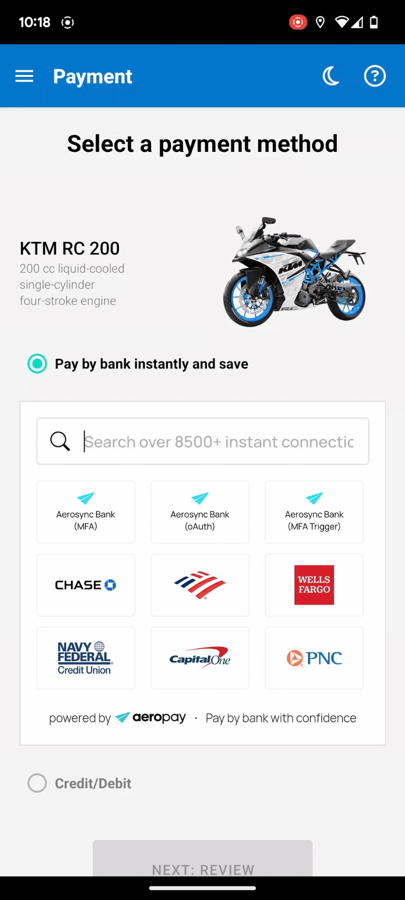
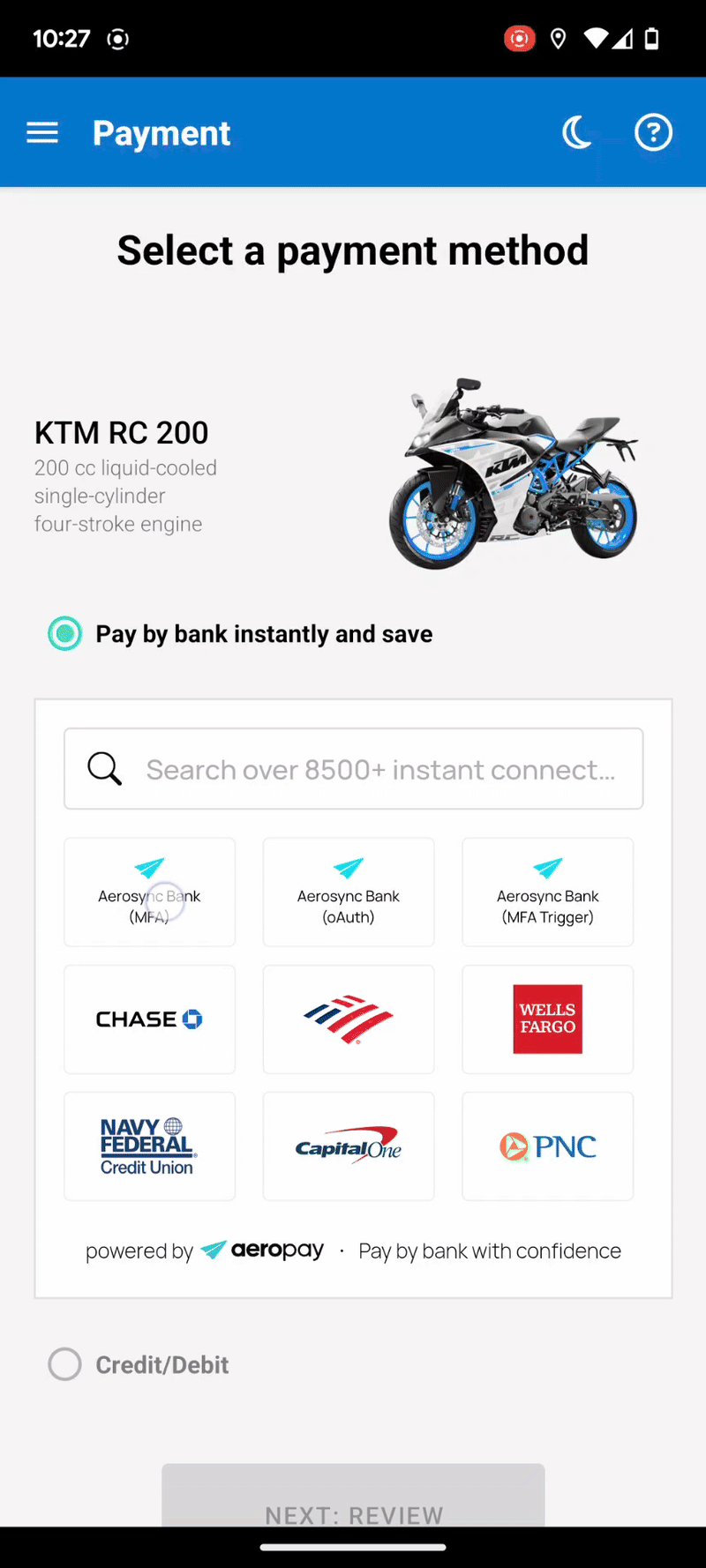
The Embedded View offers a streamlined alternative to the traditional Aerosync widget launch for React Native clients, enabling a seamless and intuitive user experience. By integrating the bank selection interface directly into your screen, users can easily browse or search for their preferred bank without leaving your platform. Once a bank is selected, the Aerosync widget will be launched, allowing users to log in and link their bank accounts quickly and securely. This approach significantly reduces friction in the user journey & accelerates the linking process. For optimal performance and user satisfaction, we strongly recommend those leveraging the React Native SDK to adopt the embedded flow.
Setting Up the Embedded View
The example below shows the basic setup required to display the embedded view of AeroSync’s bank list. You can explore the full demo app here: View demo app.
To use the embedded view, place it on any screen where the user is expected to select a bank—typically a payment or checkout page.
For better maintainability and separation of concerns, we recommend placing the AeroSync embedded view and AeroSync widget in separate components (e.g. Embedded.tsx and Widget.tsx).
The <AeroSyncEmbeddedView> view should be displayed by default to show the list of banks.
When a user taps on a bank, the <AeroSyncWidget> should be triggered to complete the full bank linking process.
PaymentScreen.tsx
import {
  AeroSyncWidget,
  Environment,
  SuccessEventType,
  WidgetEventType,
  AeroSyncEmbeddedView,
  WidgetEventBankClickType
} from "aerosync-react-native-sdk";

import { SafeAreaView, ScrollView, StyleSheet, Text, View } from "react-native";
import { useState } from "react";
import Toast from "react-native-toast-message";
import Modal from 'react-native-modal';
import { useStore } from "../context/StoreContext";
import { useThemeContext } from "../context/ThemeContext";

export default function PaymentScreen() {
  const { widgetConfig } = useStore();
  const { isDarkTheme } = useThemeContext();

  // State to control whether the widge is shown
  const [isWidgetEnabled, setIsWidgetEnabled] = useState(false);

  // Stores the stateCode returned from embedded view for initializing the widget
  const [embeddedStateCode, setEmbeddedStateCode] = useState('');

  // Determine widget theme based on app theme
  const currentTheme = isDarkTheme ? 'dark' : 'light';

  // Deeplink scheme used for routing back from external services
  const DEEP_LINK = 'syncroVibeReactCli://';

  // --- Callback: Widget loaded successfully
  const onWidgetLoad = () => {
    console.log('Widget loaded');
  };

  // --- Callback: Widget was closed (either manually or automatically)
  const onWidgetClose = () => {
    console.log('Widget closed');
    setIsWidgetEnabled(false);  // Hide widget modal
  };

  // --- Callback: User successfully linked their bank and widget closed
  const onWidgetSuccess = (event: SuccessEventType) => {
    console.log('Bank linking successful', event);
    setIsWidgetEnabled(false);  // Hide widget modal

    // Show a toast to inform the user of success(optional)
    Toast.show({
      type: 'success',
      text1: 'Bank linked successfully!',
    });
  };

  // --- Callback: Fired on every widget event
  const onWidgetEvent = (event: WidgetEventType) => {
    console.log('Widget event:', event);
  };

  // --- Callback: Widget encountered an error
  const onWidgetError = (event: string) => {
    console.log('Widget error:', event);
  };

  // --- Callback: User tapped a bank in the embedded view
  const onEmbeddedBankClick = (event: WidgetEventBankClickType) => {
    // Store stateCode and show the widget modal
    // Required to properly initiate the full bank linking flow
    if (event.stateCode) {
      setEmbeddedStateCode(event.stateCode);
      setIsWidgetEnabled(true);
    }
  };

  // --- Callback: Embedded view loaded successfully
  const onEmbeddedLoad = () => {
    console.log('Embedded view loaded');
  };

  // --- Callback: Embedded view encountered an error
  const onEmbeddedError = (event: string) => {
    console.log('Embedded view error:', event);
  };

  return (
    <SafeAreaView style={{ flex: 1 }}>

      {/*
  			Full-screen modal to display the AeroSync widget after a bank is selected.
  			This modal is optional — you can customize or replace it with your own
        layout/styling as needed.
			*/}
      <Modal
        style={styles.modal}
        isVisible={isWidgetEnabled}
        propagateSwipe
        animationIn="slideInUp"
        animationOut="slideOutDown"
        animationInTiming={600}
        animationOutTiming={600}
      >
        {/* AeroSync Widget: bank linking process */}
        <AeroSyncWidget
          stateCode={embeddedStateCode}
          onLoad={onWidgetLoad}
          onError={onWidgetError}
          onClose={onWidgetClose}
          onEvent={onWidgetEvent}
          onSuccess={onWidgetSuccess}
          token={widgetConfig!.token}
          deeplink={DEEP_LINK}
          theme={currentTheme}
          consumerId={widgetConfig?.configurationId}
          environment={widgetConfig?.environment!}
          customWebViewProps={{
            style: { marginTop: 30, backgroundColor: isDarkTheme ? '#000000' : '#FFFFFF' }
          }}
        />
      </Modal>

      {/* Main content area */}
      <ScrollView>
        <View style={styles.container}>

          <Text style={styles.title}>Select a payment method</Text>

          {/* Embedded bank list view for user to choose their bank */}
          <View style={styles.embeddedView}>
            <AeroSyncEmbeddedView
              onLoad={onEmbeddedLoad}
              onBankClick={onEmbeddedBankClick}
              onError={onEmbeddedError}
              theme={currentTheme}
              token={widgetConfig!.token}
              deeplink="testaerosyncsample://"
              consumerId={widgetConfig?.configurationId}
              environment={(widgetConfig?.environment ?? 'dev') as Environment}
              {...(widgetConfig?.configurationId ? { configurationId: widgetConfig.configurationId } : {})}
            />
          </View>

        </View>
      </ScrollView>
    </SafeAreaView>
  );
}

const styles = StyleSheet.create({
  container: {
    flex: 1,
    padding: 20,
    justifyContent: 'flex-start',
    backgroundColor: '#fff',
  },
  title: {
    fontSize: 24,
    fontWeight: 'bold',
    marginBottom: 20,
    textAlign: 'center',
  },
  linkButton: {
    marginBottom: 20,
    justifyContent: 'center',
    alignItems: 'center',
    width: '100%',
    height: 60,
    backgroundColor: '#80bfff'
  },
  embeddedView: {
    marginBottom: 20,
    height: 358,
    borderWidth: 1,
    borderColor: '#E0E0E0',
  },
  modal: {
    justifyContent: 'flex-end',
    margin: 0,
  },
});
Resizing the Embedded View
The embedded view is designed to be responsive across different screen sizes. As the available space changes, the number of tiles displayed within the view will adjust accordingly.
The table below shows the number of tile rows and columns displayed at various screen breakpoints:
| Width | Height | Rows | Columns |
|---|---|---|---|
| ≥ 572px | ≥ 356px | 3 | 5 |
| 464px – 571px | ≥ 356px | 3 | 4 |
| 356px – 463px | ≥ 356px | 3 | 3 |
| ≤ 355px | ≥ 356px | 3 | 2 |
| ≥ 572px | 282px – 355px | 2 | 5 |
| 464px – 571px | 282px – 355px | 2 | 4 |
| 356px – 463px | 282px – 355px | 2 | 3 |
| ≤ 355px | 282px – 355px | 2 | 2 |
| ≥ 572px | ≤ 281px | 1 | 5 |
| 464px – 571px | ≤ 281px | 1 | 4 |
| 356px – 463px | ≤ 281px | 1 | 3 |
| ≤ 355px | ≤ 281px | 1 | 2 |
Demo
To quickly test the embedded view, you can clone the GitHub repository:
https://github.com/Aeropay-inc/aerosync-react-native-sdk/tree/main/demo/syncReactNativeCLI